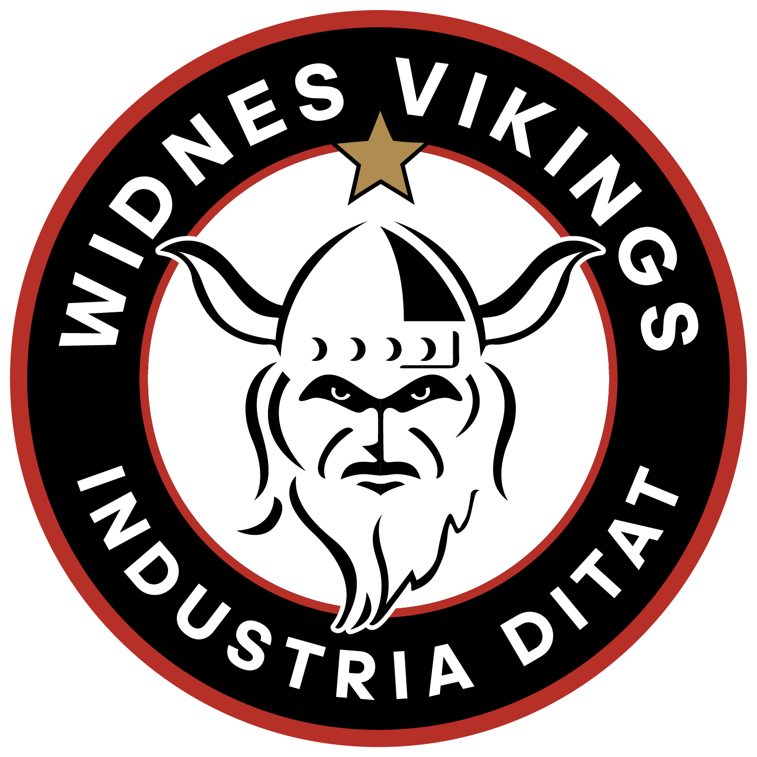
Widnes Vikings are delighted to reveal a new club crest to take the club in to a new era while celebrating the club’s rich history.
The project to re-launch the club crest has been ongoing throughout 2025 and will come in to immediate effect, featuring on the club’s new kits for the 2026 season, released on December 8th.
Vikings chairman Stuart Murphy said: “One of the main decisions to change was that we needed an identity. If you showed this to someone and asked what it is, they would tell you Vikings. The previous crest, that was supposed to be the bottom of a longboat, didn’t clearly signify who we are. Another reason to change was that we were the only club in Super League and Championship that had any floating items left on our crest, meaning it was difficult to use our crest in certain ways.
“Industry is a massive thing for this town. We felt it very important to include Industria Ditat on the new crest. We’ve just had our 150th year where we’ve used our heritage crest, that includes those words. I stood at the War Memorial in Victoria Park on Remembrance Day recently and you look directly up at it and ‘Industria Ditat’ is there. It’s important it’s there for us, because that’s what we are about.
“We’ve done a lot of product research in the background over the last 12 months to see what people thought and how it will be received. We brought the Viking head back on to a few things, we had the 2001 shirt re-release just to see how it went, and the reason was to get feedback from the people of Widnes, and it’s gone down really well, the number of people who’ve said ‘Vikings that’s what we are’.
“We’re really excited to see it out there. It’s been a major project since February, working on everything that requires changing, working with RL Commercial and the RFL; working with designers; kit designs start in May to get produced in time, you won’t believe how much work has gone in to it!”
Breaking down the new Vikings crest
The components that make up the new club crest are as follows:
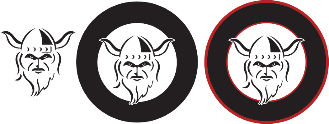
Viking head: the identity of the club, what we stand for and how we are made. The Viking head returns to the club logo after a 17-year absence, with the shadow removed from the previous iteration to give more definition.
Black Circle: showing unity, with no beginning and no end. This makes the crest a solid shape that can be used in many more ways than previous and without losing quality. We were previously the only club in Super League and Championship without a solid crest for application.
Red Circles: representing our Viking bloodline, and highlighting our World and European honours
Widnes Vikings: the club name now forms a clear part of the logo
Industria Ditat: the Latin phrase for Industry Enriches, the motto for our town and part of the town crest, previously used by the club
1875: the year the club was formed, showcasing our rich heritage

Gold Star: a much called for return, to highlight that Widnes were World Champions

Usage
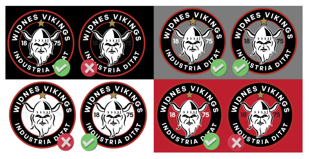
The central element of the crest is transparent, to enable it to be utilised in various contexts, shown below.
The story
We rise not from comfort, but from challenge.
And in every drop of rain, every roar of the crowd, We remember who we are.
From the storms we’ve faced… to the battles ahead. Today sees the start of a new era in the club’s history.
Resilience. Courage. Strategy.
Strength in our past.
Power in our people.
We are Widnes Vikings.
In Our DNA.
The evolution of Widnes Vikings
In Our DNA
The club’s strapline for 2026 is ‘In Our DNA’ – because it is. We are Widnes Vikings.
The first kits with the new crest, together with a new range of merchandise, will be launched on December 8.
